Final year Advertising Student creating a communications campaign to engage young, disconnected New Zealanders with Anzac history. My project with be the hypothetical campaign for the (very real) 2015 experiential Anzacs exhibition in Te Papa. I love suggestions, encouragement, critiques and puns! Do get in contact. pseudosoydesign@gmail.com // @thishuei
Sunday, September 29, 2013
Thursday, September 26, 2013
Video placements
Strategic video placements.
Themes and genre of movie/show—
Jack—mates, FRIENDSHIP, pain, death, camaraderie: Adventure & Drama
Four walls—claustrophobia, mental, memory, FEAR: Thriller/Horror, Drama.
Thank Christ—LOVE, death, return, home, family: Romance & Drama.
Themes and genre of movie/show—
Jack—mates, FRIENDSHIP, pain, death, camaraderie: Adventure & Drama
Four walls—claustrophobia, mental, memory, FEAR: Thriller/Horror, Drama.
Thank Christ—LOVE, death, return, home, family: Romance & Drama.
Type Ads
Some notes on copy:
Visuals and theme—
Typhoid—FOOD: poo, read, butter, cutlery, bully beef, cans.
Bill—TOILET: toilet paper, poo, mud, beer, pint, toilets, urinals
Virgin—SEX: condoms (but doesn't make sense?), disinfectant, tubes, STD warts, redness, soreness.
Feel human—HYGIENE: soap, mud, ocean, water, swim, blood.
Big and Little—FLIES, LICE: flies, lice, black spots, blood splotches.
Imprinting type onto the objects the story revolve around.
Newspaper headline styles.
Within a silhouetted shape. Reversed out text, but not CTA.
Letter pressed feel.
Illustration and handwritten typography.
Neon sign (esp sex?)
Type interacting with image.(eg: shot at trying to feel human)
Painted table with place (eg. bread and butter best meal)
Straight text overlayed on image.
Noma Bar esque graphic illustration. Flat colour, straight type.
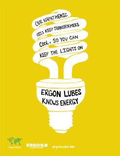
Type overlayed on B/W image. Impactful.
Illustrative flat colour and handwritten type. A sure popular choice in this year's grad group.
Image with shallow DOF and overlayed type.
Twisted image, straight line. Open composition. Minimal colours. Perhaps banana with tube for sex?
Paper typography. Lovely. Colour is powerful and handmadeness adds a personal dimension without resorting to handwritten typography.
Textured background. More for the video.
Strong, flat colour.
Handwritten typography reflective of character; much like Fear and Loathing Indian ink typography.
Written and reversed out of 'blood'. Gruesome, and perhaps not fitting. But the idea of scratching out of a substance is interesting.
Expressive and gestural brush work.
Handwritten humbly on B/W photographs. Much like a memoir.
Subscribe to:
Comments (Atom)


