Talked to Nick, who gave me a quick Type 1 lecture. Useful.
Also, flickering at CTA is too wannabe. My executions have to be understated in style. Sorta like the quiet stories, humble and honest. Pragmatic. Not flashy.
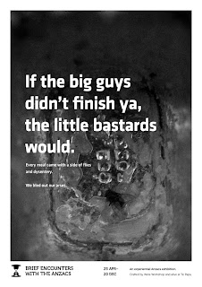
Having to fight back urges to complicate things. Visually not gooey and yummy and fun. But that doesn't fit tonally. Also photographs of the time period are hard to come by and not exactly what I want.
Photos with the print don't work as well as without as they tend to distract from the stories. Black and white works best.
Yes.
To do:
Write report.
Make presentation.
Print posters.
Stick posters up at strategic locations; photograph.
Make CTA like before. Casual in and out fade. Quiet.
Also, would like to make the black a subtle charcoal and have a texture overlay like this piece from very lovely, The International Office.


